Voyages-sncf.com (VSC), now operating as SNCF connect, served as the official travel booking platform for SNCF, France’s national railway company. With millions of users booking train tickets, planning multi-modal journeys, and accessing travel services across desktop and mobile devices, VSC had evolved into a highly complex digital ecosystem.
Over time, however, its user interfaces had become fragmented due to multiple updates, marketing campaigns, and ad hoc features developed in parallel. This fragmentation led to inconsistent visuals, duplicated components, and an uneven user experience across devices and user journeys.
To address this, VSC initiated a strategic effort to develop a cohesive and scalable design system, one that would:
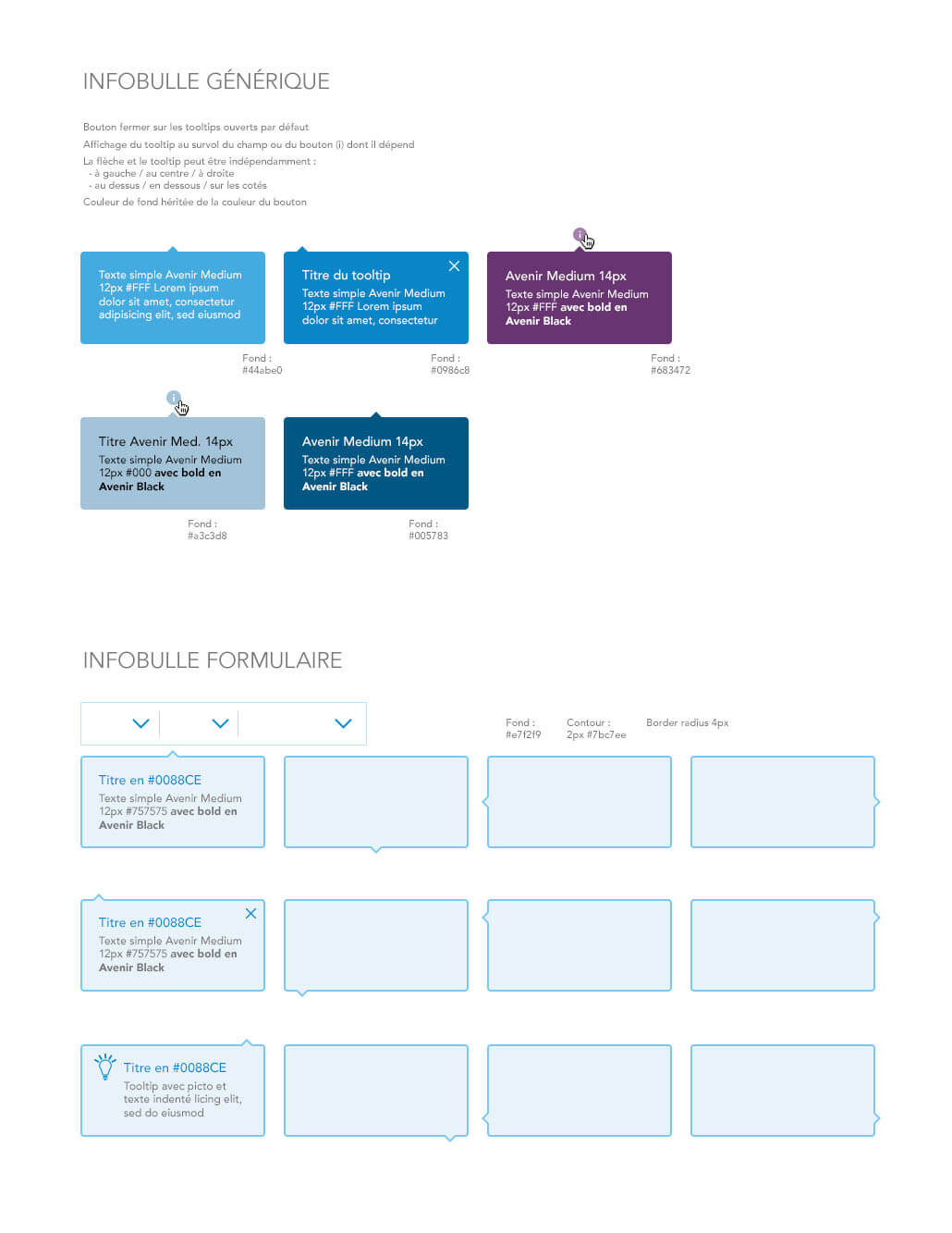
This case study documents the core components of that system — including buttons, links, tooltips, tabs, messages (MEAs), and form fields — each crafted with deliberate attention to visual hierarchy, accessibility, responsiveness, and user interaction patterns.
By creating this unified design system, VSC was able to reduce design debt, accelerate production cycles, and deliver a more intuitive, elegant travel experience for millions of users across France and Europe.
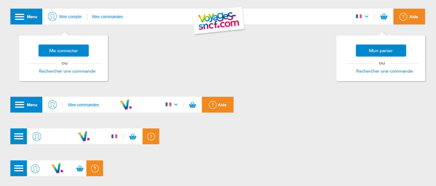
The navigation system was designed for clarity, ease of use, and mobile responsiveness. Features include dropdowns for login/cart, persistent header elements, and contextual tooltips.
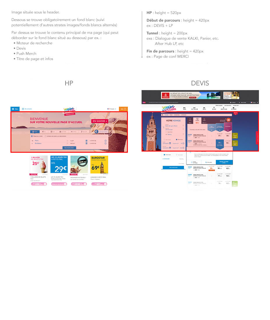
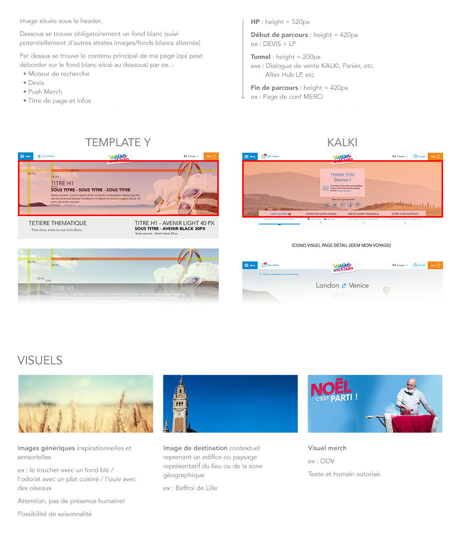
To guide users through a wide range of tasks, from browsing destinations to booking tickets, we structured the site around modular visual templates such as HP (Homepage), DEVIS, KALKI, and Template Y.
The foundation of any interface lies in its action elements: buttons. At Voyages-sncf.com, we designed a comprehensive button system based on size, priority, and interaction state.
Variants: Principal, Secondaire, Principal 2, Secondaire 2
Sizes: Large, Medium, Small
States: Default, Hover, Dark Background Mode
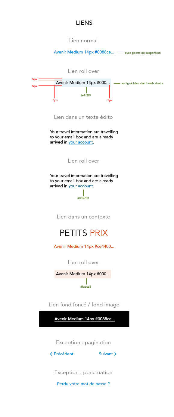
We crafted a link system to guide users with clarity and consistency, using clear hover states and contextual cues like blue or orange color coding.
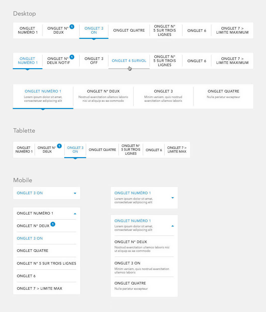
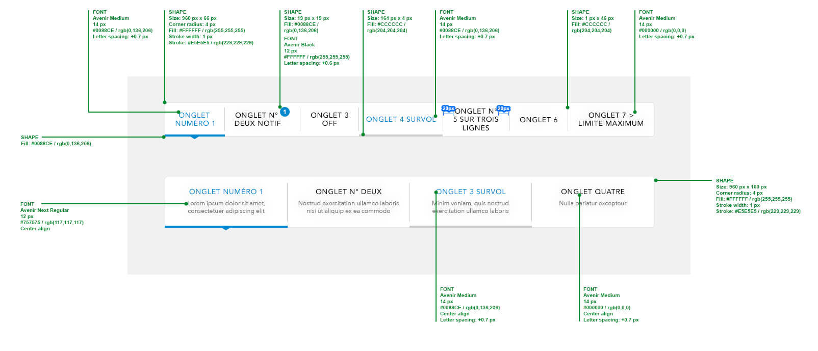
We designed a tab system (onglets) to organize multi-step flows and content-heavy modules. It supports hover, active, and notification states and adapts to mobile layouts.
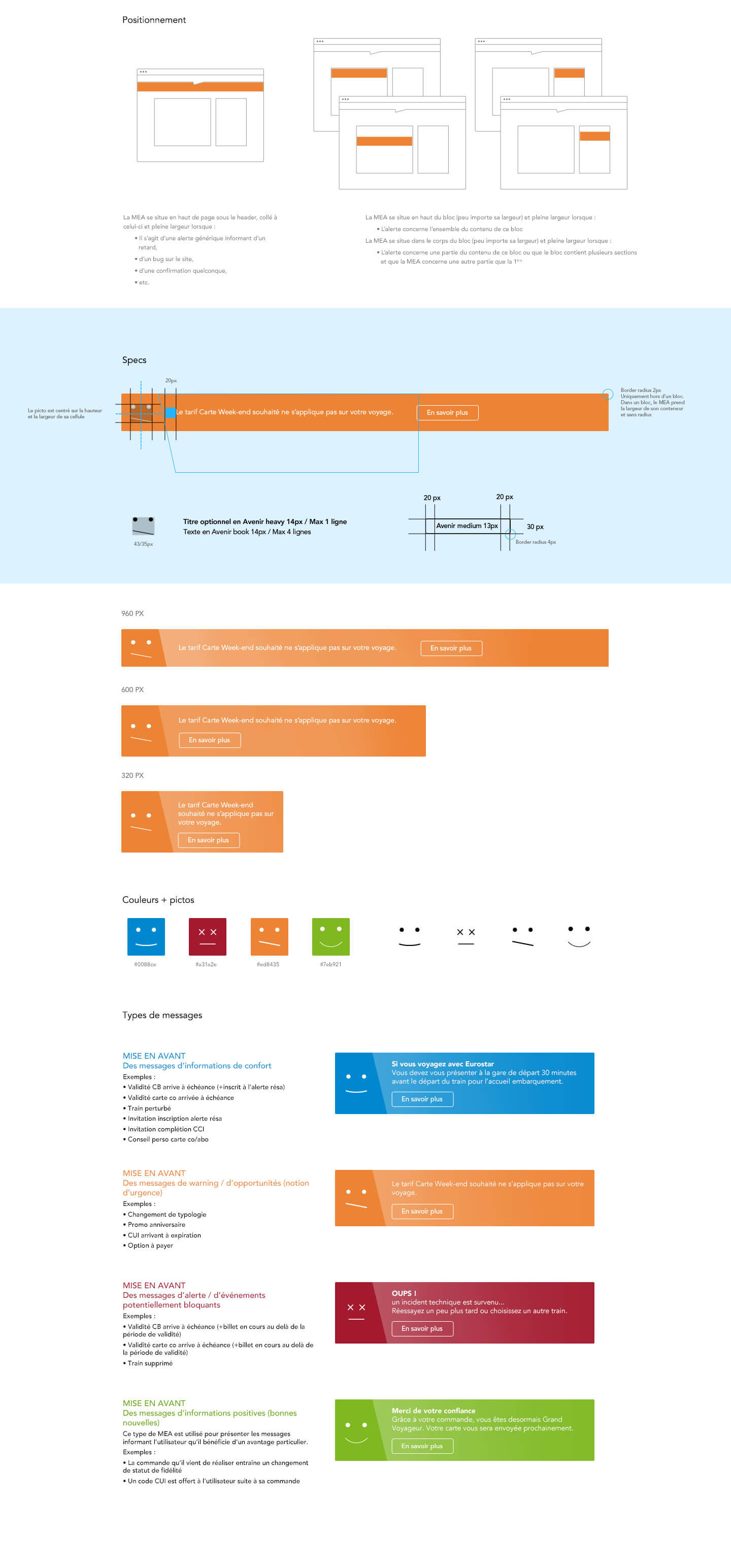
MEAs (Message d’Erreur ou d’Alerte) are banners that surface critical messages, using color and icon coding to indicate urgency and type.
A clear icon system is essential for international users and accessibility.
We built a modular form system that supports validation, focus, and error handling across a responsive layout. Field types include text, date, select, checkbox, and radio.Input fields were designed with clear states for focus, error, and success. This ensures users receive immediate feedback on their interactions.
By unifying the brand’s visual language and interaction logic, we created a system that enables: Design and development alignment, reducing redundancies and accelerating production. Cross-platform cohesion ensuring that mobile, tablet, and desktop interfaces behave predictably and feel connected.
User confidence and ease of use thanks to clear hierarchies, consistent feedback, and accessible interaction patterns. Marketing flexibility with modular templates and adaptable components that support rapid campaign deployment without compromising UX. Brand reinforcement through the intentional use of typography, iconography, color, and tone that reflect SNCF’s values: reliability, clarity, and approachability.
ltimately, this system empowers multidisciplinary teams designers, developers, marketers, and product owners to speak the same design language, focus on what matters most to users, and continuously evolve the platform without starting from scratch each time. It is a scalable, future-ready framework that not only supports the business, but enhances the travel experience for millions of people every day — turning complexity into clarity, and digital interactions into meaningful journeys.