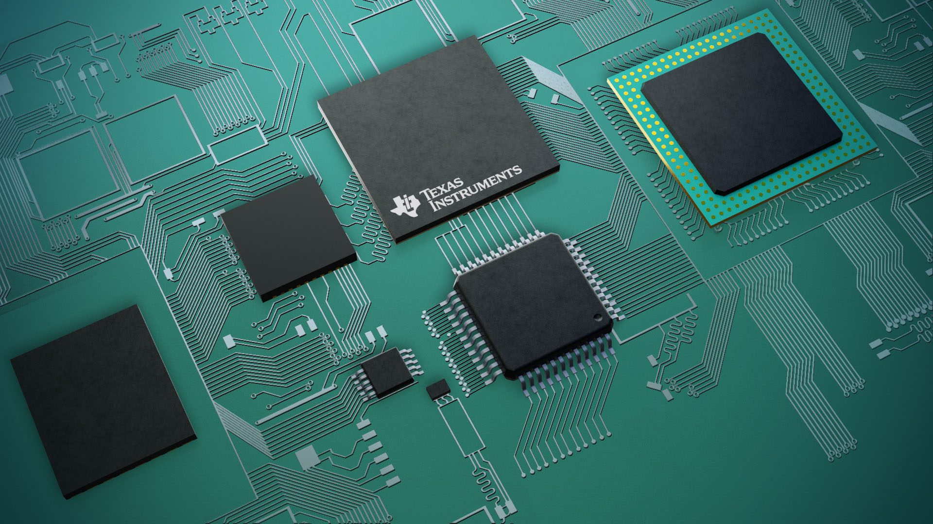
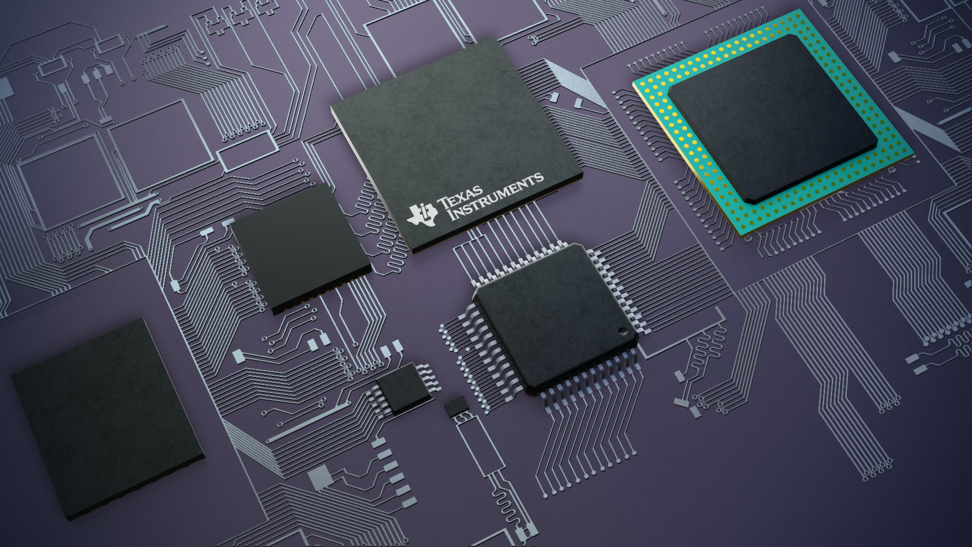
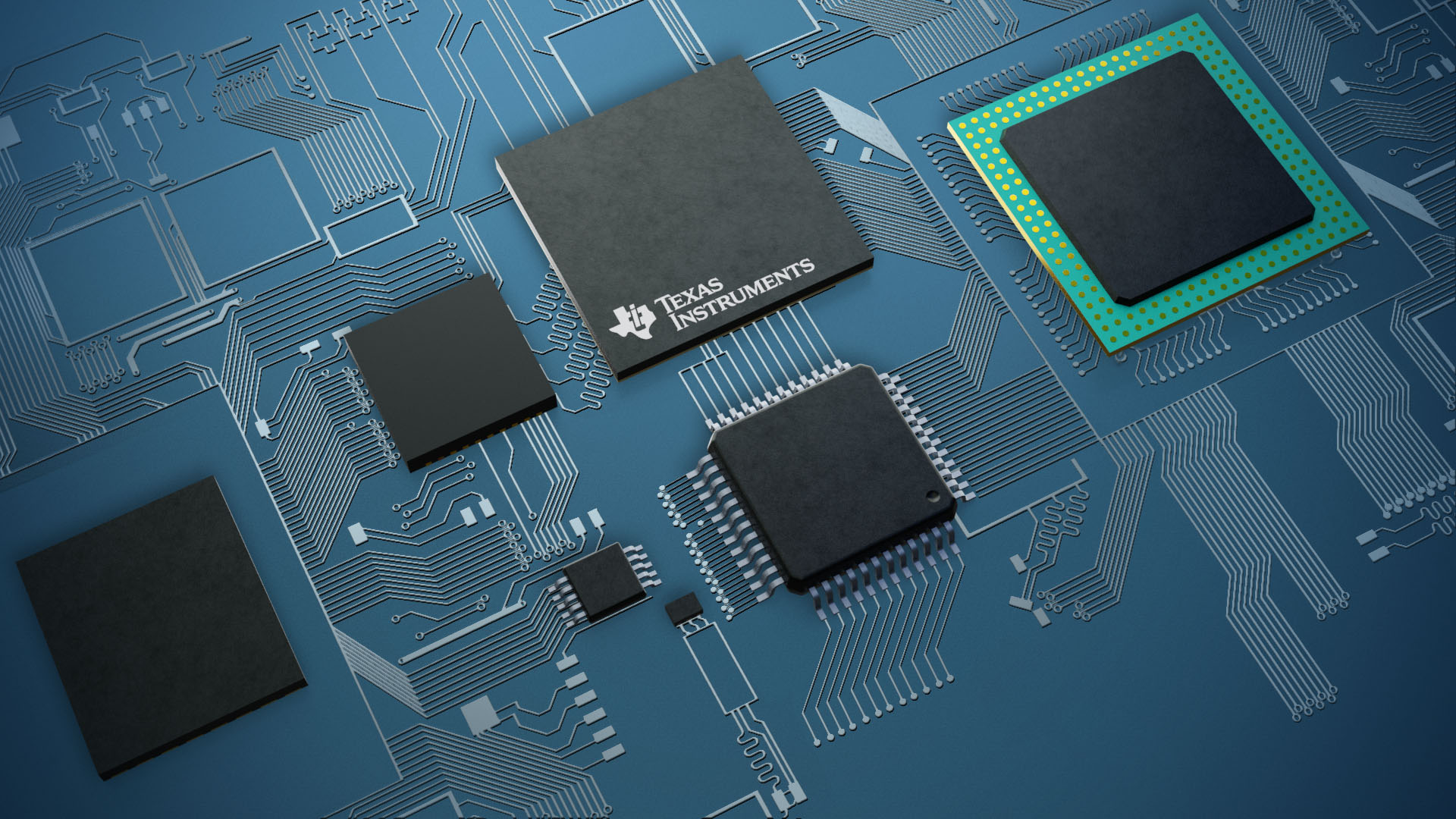
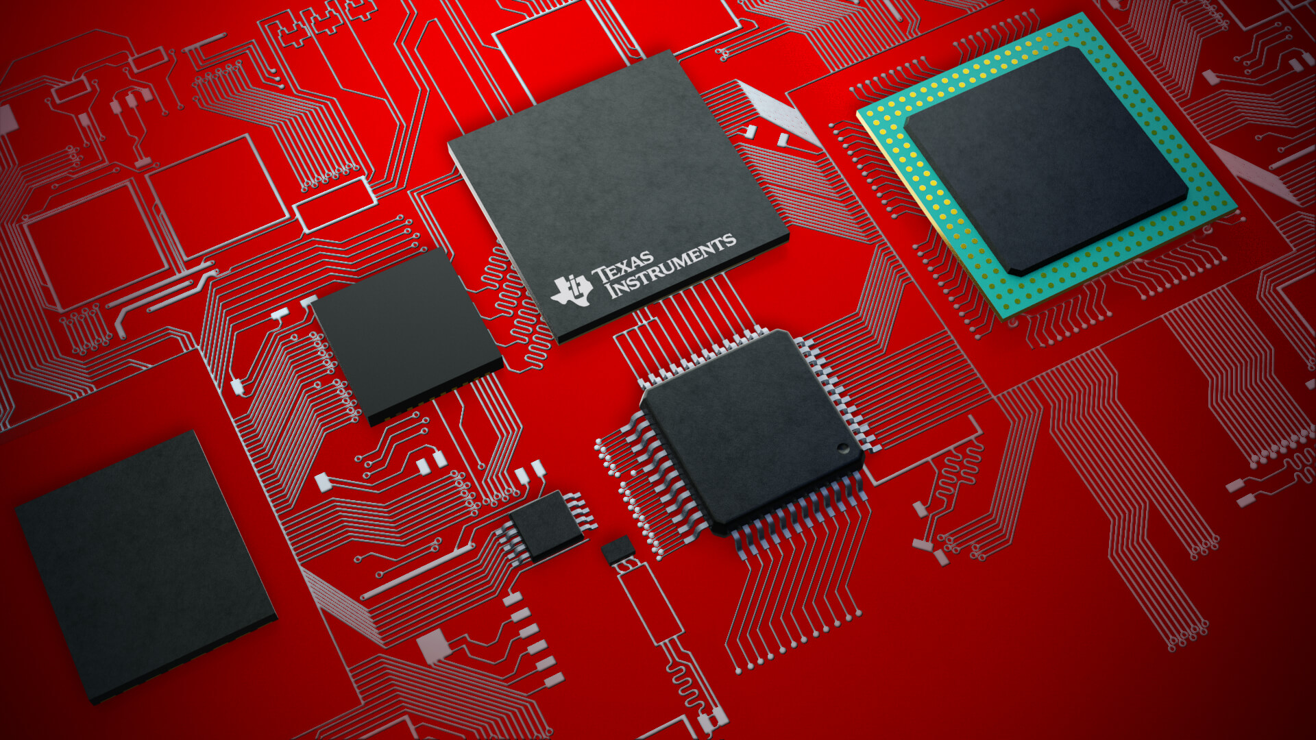
Texas Instruments

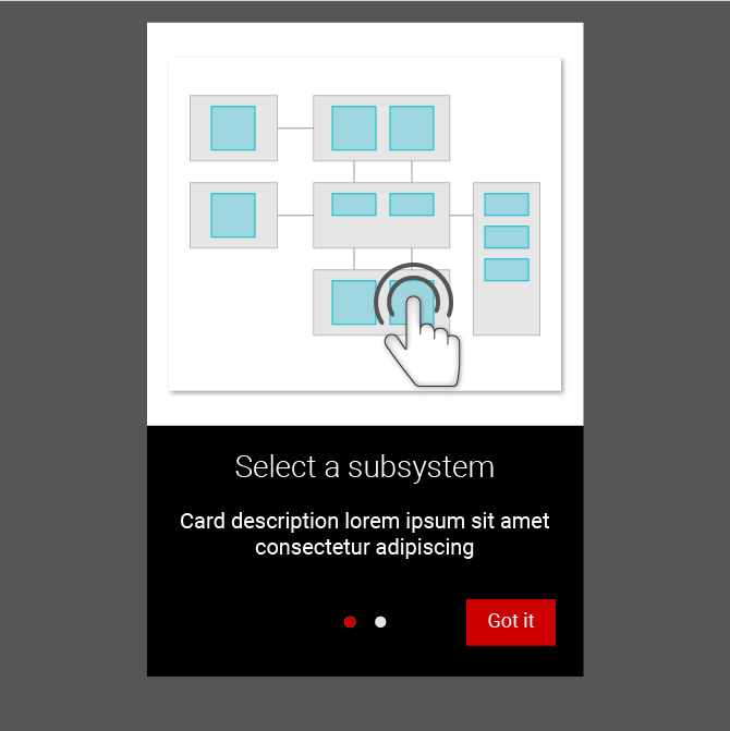
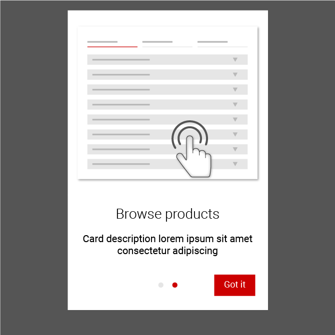
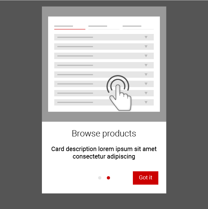
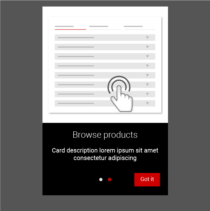
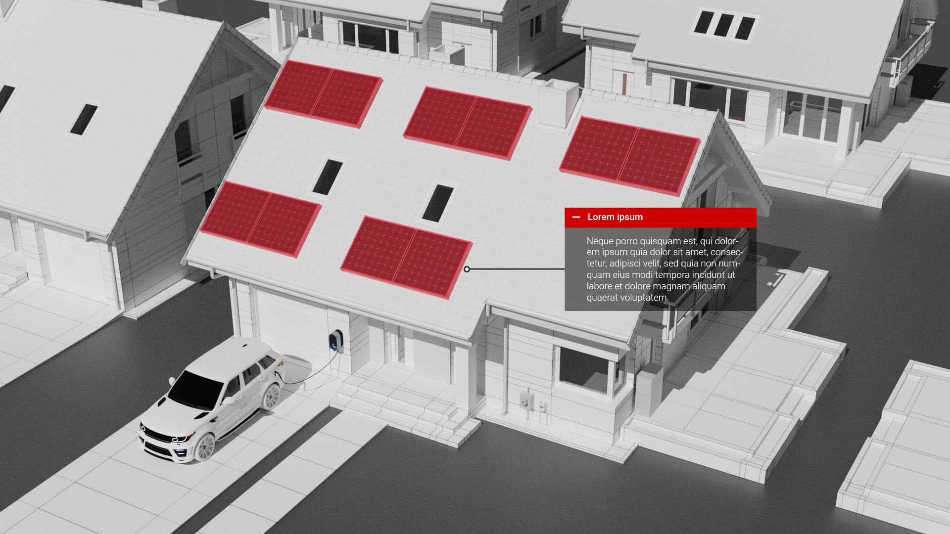
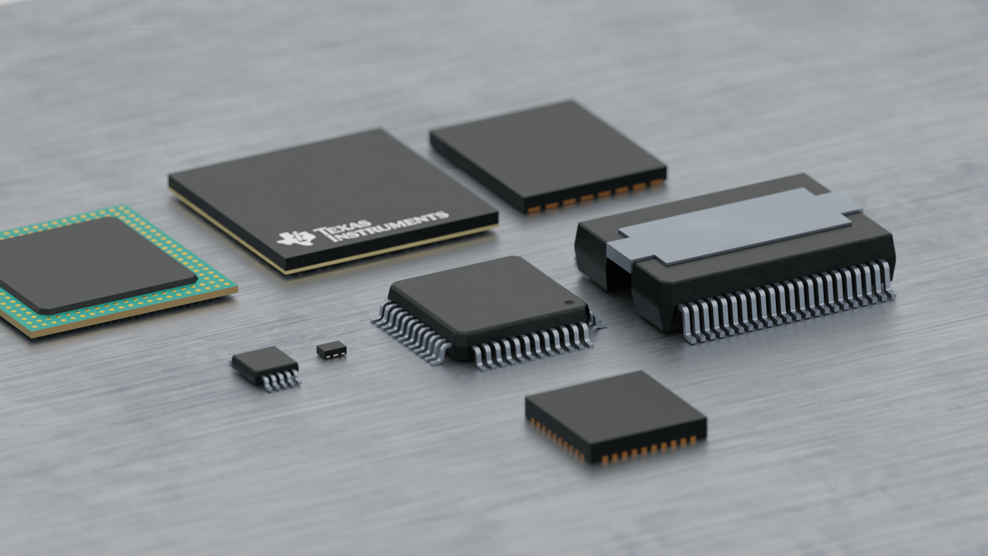
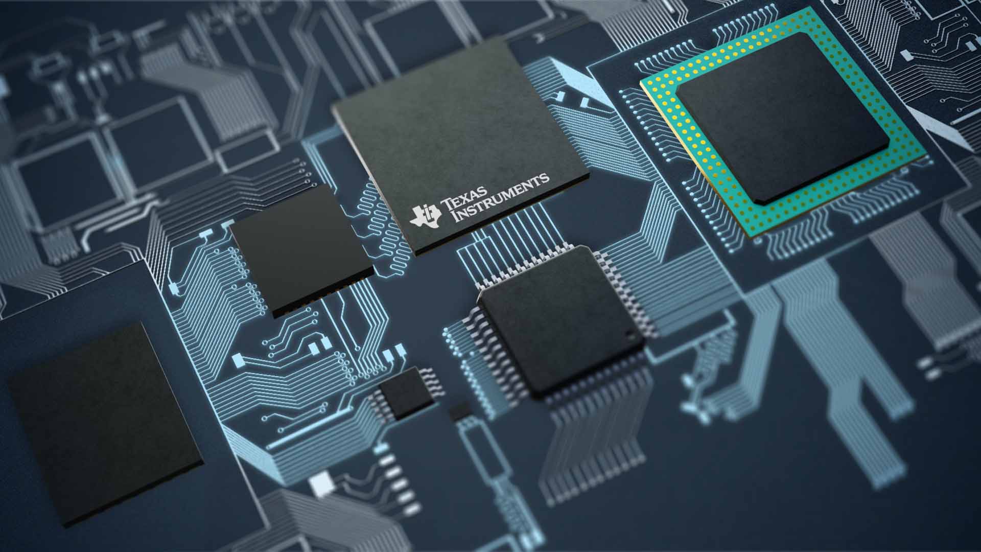
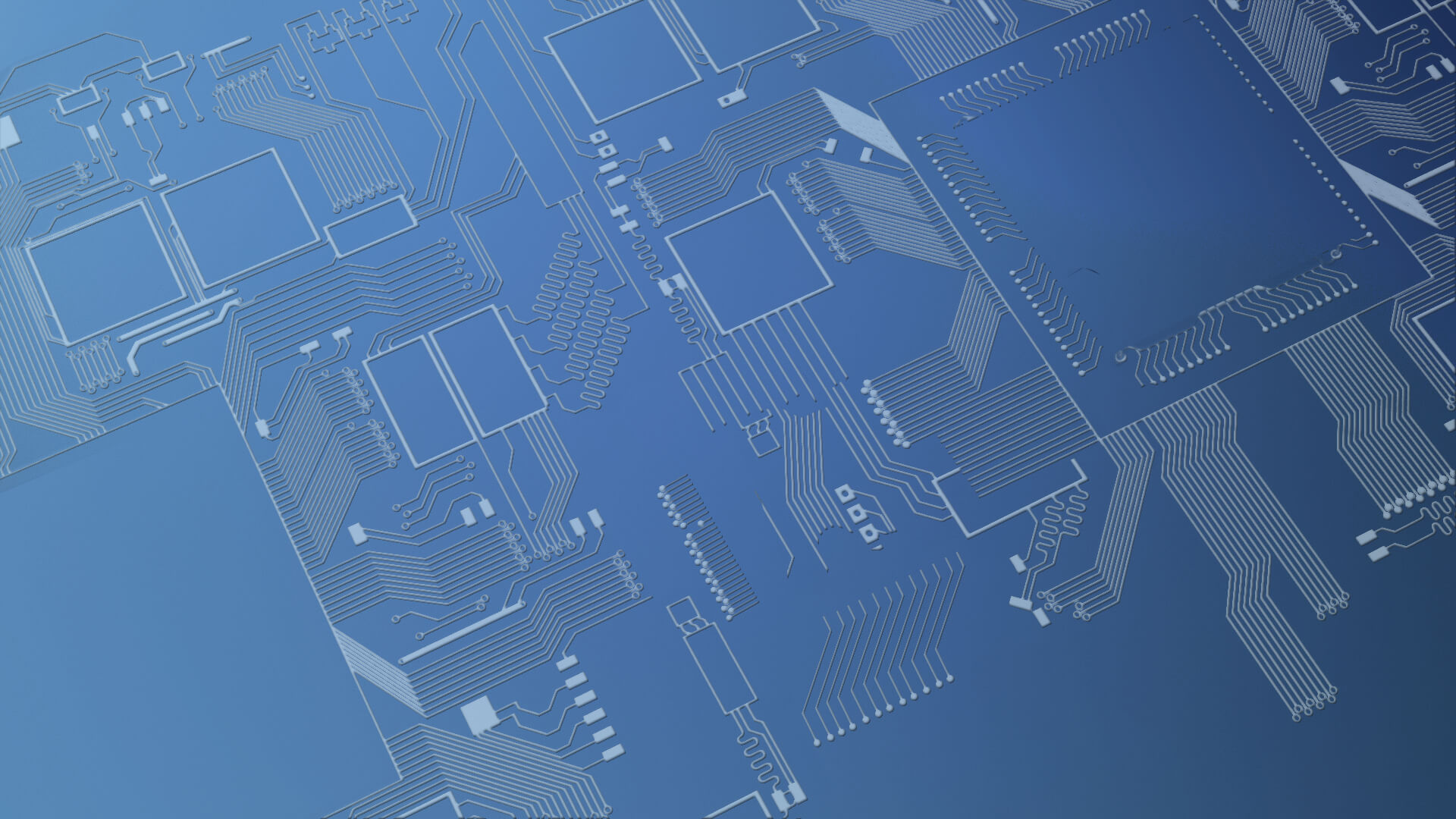
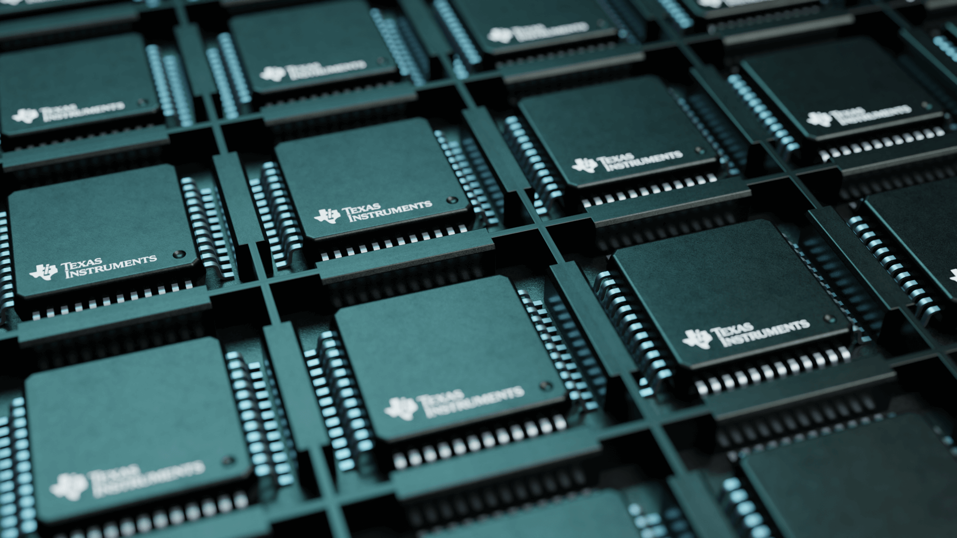
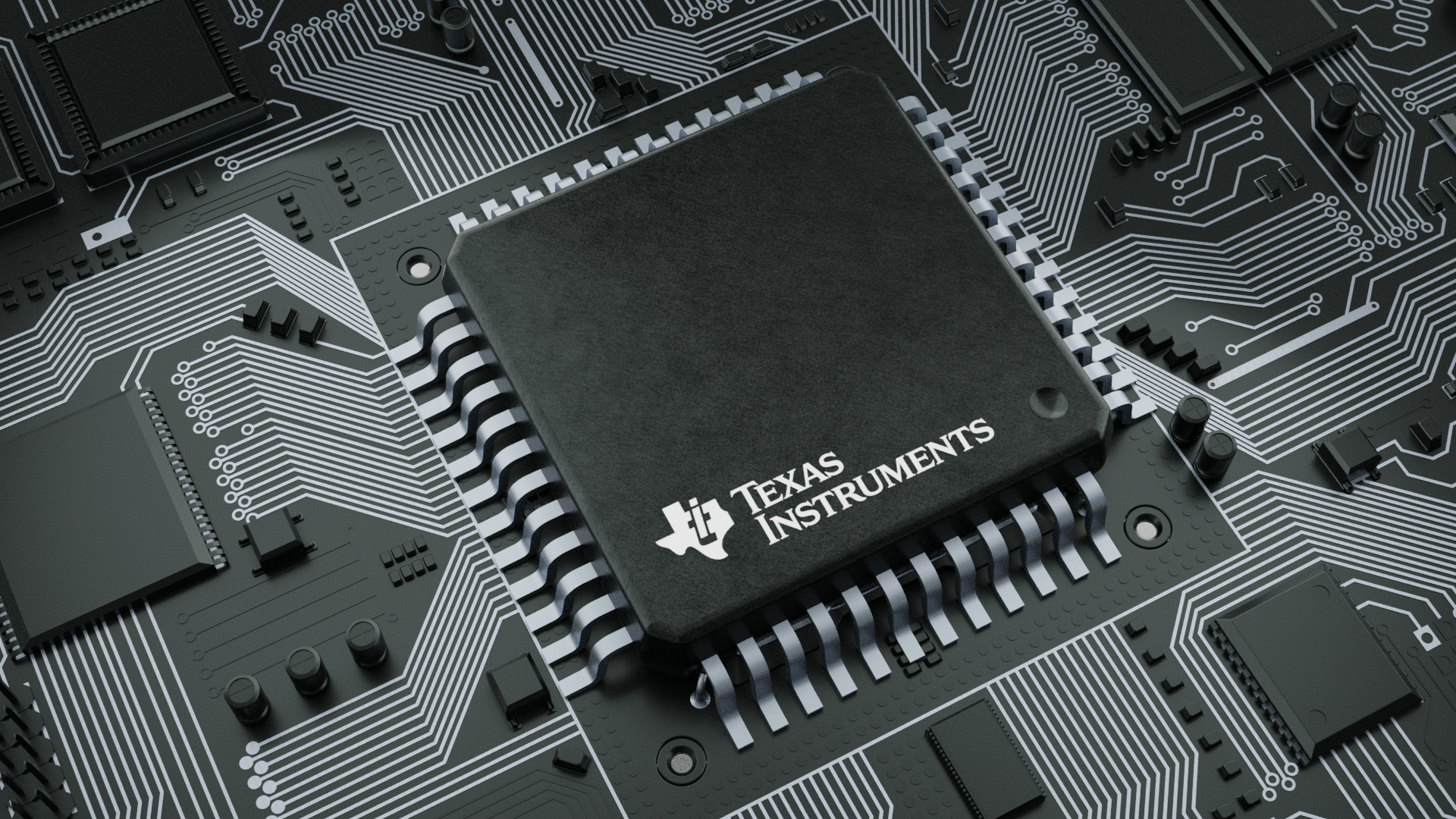
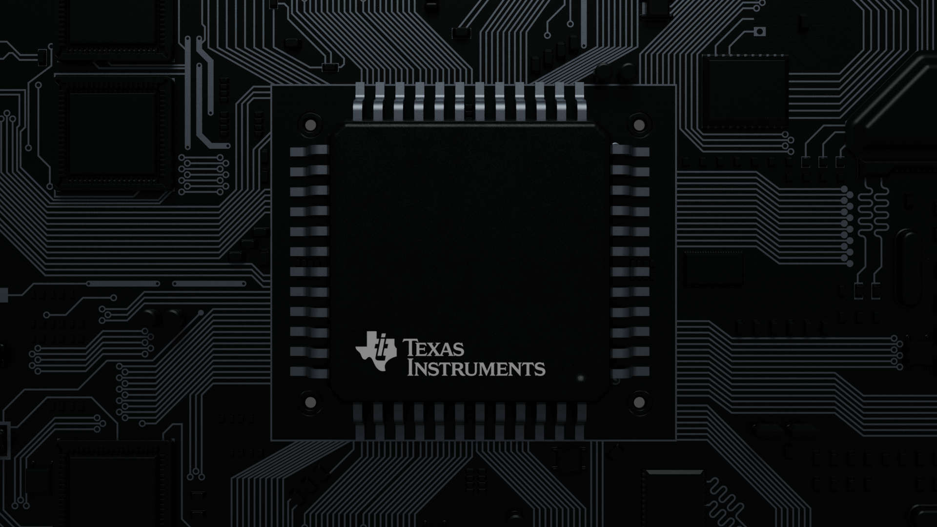
From simplifying navigation in technical tools to crafting photorealistic chip renders for product families, the work spanned functional UX enhancements to cinematic brand moments — all grounded in TI’s identity as a leader in embedded systems and semiconductors.

  • ClientTexas Instruments
  • Industrysemiconductor - electronic systems
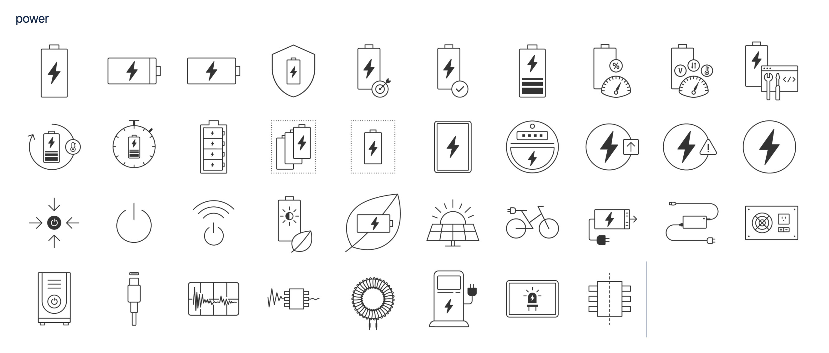
  • Services 3D visualization, UX design, Iconography
Elevating the Digital Experience for Texas Instruments:
From User Onboarding to Visual Storytelling

As a multidisciplinary designer collaborating with Texas Instruments (TI), I led a series of initiatives aimed at enhancing the usability, visual communication, and product storytelling across TI’s web ecosystem. This extended project merged UX design, iconography, 3D visualization, and motion direction to improve how TI communicates complex technologies to both engineers and decision-makers.

This case study explores four interconnected efforts.

1. Onboarding Experience Design

Improving first-time user flows for subsystem exploration with a guided, interactive tutorial overlay.

Platform: TI.com
Role: UX/UI Designer, Visual Designer
Tools: Figma, Adobe Creative Suite, Adobe XD
Project Type: Feature enhancement – onboarding experience

Texas Instruments (TI) maintains a complex interface for engineers to explore reference designs and product subsystems. While functionally rich, the interface posed challenges for first-time users unfamiliar with navigating block diagrams, subsystem dropdowns, and detailed product filters.

  • Goals
  • 1. Improve first-time user experience: the Reference Designs & Products interface.

    2. Educate users about key functionalities like:

    • Selecting subsystems
    • Browsing components
    • Accessing reference schematics

    3. Respect Expert Users: Maintain non-intrusive behavior that respects expert users.

  • Challenges
  • The interface was already highly technical, requiring any overlay to avoid obstructing contextual content.

    The onboarding system had to work within the constraints of existing layout and component behaviors.

    Maintain accessibility and responsiveness.

Info UX/UI Solution


A 3-step interactive tutorial was created using a modal overlay system with contextual illustrations, text instructions, and a “Got it” call-to-action.

Selecting a subsystem

Block diagram + red target icon

Browsing product lists

Accordion list + hand cursor

Exploring detailed reference designs

Tabs + schematic preview

  • Variations Explored
  • Design Consistency

  • Different iconography and layout designs were tested:

    • Pointer cursor vs. finger tap
    • Light vs. dark background opacity
    • Dot navigation with active step indicator
    • Card padding and visual clarity refinement
  • Results
    • Increased engagement: First-time users were more likely to interact with subsystem filters after onboarding.
    • Reduced confusion: Fewer help center clicks during A/B testing period.
    • Smoother handover: Developers were able to integrate the overlay with minimal layout disruption.
  • Reflection
  • This project demonstrates how layered onboarding experiences can simplify complex technical tools without dumbing them down. The success came from:

    • Selecting subsystems
    • Browsing components
    • Accessing reference schematics
  • Next Steps
    • Consider contextual tooltips for deeper elements (e.g., amplifier sub-filters).
    • Explore user preference memory to avoid repeat overlays on return visits.
    • Expand tutorial to mobile views.
2. Scalable Icon System

Improving first-time user flows for subsystem exploration with a guided, interactive tutorial overlay.

Role: Visual Designer

Scope:

  • Custom icon design for illustrating categories in technical content

  • Goals
    • Create a cohesive icon library that enhances scannability and comprehension on resource-heavy pages.
    • Ensure visual alignment with TI’s existing UI elements and tone.
    • Design with reusability and system scalability in mind for all categories: IDEs, SDKs, dev tools, training, and more.

  • Process
  • Audit & Style Analysis

    • Analyzed TI.com’s current visual language.
    • Observed stroke widths, padding, alignment style, and use of negative space.
    • Identified inconsistencies in legacy icons and opportunities for standardization.

Design Exploration

Multiple icon explorations were developed for “Academy / Training” resources: the goal here is to incentivize learning and skill development among engineers and developers.

Variation 1

Graduation cap inside browser window, with gear overlay (symbolic of online learning + engineering).

Variation 2

Gears leading to graduation cap.

Variation 3

Alternative placement, adjusted perspective for readability at small scale.

Variation 4 Admin

Clean graduation cap with externally aligned gears, more breathable and modular.

System Integration - a

Worked closely with developers and content teams to deploy icons across:

Different iconography and layout designs were tested:

  • Icon variation 08
  • Category cards (e.g. "C2000 Academy", "SysConfig", "Uniflash")

System Integration - b

Worked closely with developers and content teams to deploy icons across:

Different iconography and layout designs were tested:

  • Icon variation 13
  • Inline resource lists

Power Icon Set

In addition to the education icon series, I contributed to a broader power icon system: the goal here is to create a unified visual language for various power-related categories across TI’s offerings.

  • Categories: Battery levels, solar energy, EV charging, wireless power, and more.
  • Visual consistency ensured through stroke weight, padding, and icon modularity.

  • Results
    • Delivered over 30+ custom icons.
    • Icons are used live on product pages, improving usability and visual communication.
    • Enabled faster comprehension of product categories across C2000 microcontroller and power tool ecosystems.
    • Created a reusable visual design system adopted across multiple TI teams.
  • Reflection
  • This iconography initiative emphasized the importance of balancing technical accuracy with user-friendly visuals. By combining symbolic clarity (e.g., graduation caps, gears) with consistent execution, we reinforced the brand's role as both a hardware provider and a learning partner.

    “Designing icons for TI.com meant bridging engineering complexity with visual elegance — making tech feel more intuitive, approachable, and structured.”

3. 3D Energy Hub Visualization

Role: Concept Artist, 3D Visualizer, UX Designer

Scope: Create a realistic 3D representation of the "Energy Hub" ecosystem from TI's technical diagram.

Goal: Help users and stakeholders visualize complex bidirectional energy flows in a modern smart-home environment — bridging engineering with customer-friendly storytelling.

  • Project Objective
  • Design enhancements

  • Texas Instruments needed a compelling visual aid to explain how bi-directional energy systems (solar + grid + battery + EV) function together. The original 2D diagram (image.png) illustrated DC/AC power flow across various nodes. However, it lacked the dynamic storytelling needed to engage both technical and non-technical audiences.
    To make this more digestible for wider audiences (e.g., sales teams, product managers, investors), we proposed and created a real-time 3D rendering of a smart neighborhood powered by an energy hub.

  • Design Breakdown
  • Component

    • Energy Hub Unit
    • Stationary Battery
    • EV with Bidirectional Charging
    • Solar Panels
    • Monitoring Interface
  • ---
  • Description

    • Central system managing DC/AC conversion, solar inputs, and EV interaction
    • Provides peak shaving and backup when EV is not home
    • Acts as backup power source during outages
    • Rooftop panels feeding into the system for cost-saving and backup
    • Real-time usage display via smart panel UI (illustrated wirelessly in 2D version)
  • 1. Modeling the Neighborhood
  • Created a stylized 3D neighborhood in Blender:

    • Modular, simplified white-box homes.
      (top-left-image)
    • Differentiated solar panel setups.
      (top-right-image)
    • Realistic driveway and garage layouts.
      (bottom-left-image)
  • 2. Keyframe Scenes
  • Each render highlights a different Energy Hub component:

    • 🚗 Car charging at night and day.
      (top-left-image)
    • 🔋 Battery discharge visuals.
      (top-right-image)
    • ☀️ Solar panel activity with red highlights.
      (bottom-left-image)
    • 🔴 Red-highlighted callouts with interactive UI mockups.
      (bottom-right-image)


  • Outcomes
    • Delivered an explainer visual series used in:
    • TI.com education page mockups.
    • Internal product walkthroughs.
    • Marketing pitches and interactive prototypes.
  • Created future potential for animated explainers or VR interaction demos.
  • Reflection
  • This project showcases how complex energy systems can be made approachable through storytelling and visual design. By combining technical precision with cinematic clarity, we transformed an engineering diagram into an engaging product vision.

    “A well-designed visualization doesn't just inform — it inspires understanding across disciplines.”

4. Heroic Chip Renders & Header Visuals

Role: 3D Artist, Visual Designer

Objective: Create high-fidelity product imagery of TI's chip families to be used in:

  • Product category landing pages
  • Hero/header visuals across web properties
  • Branding and technical marketing assets

  • Goals
  • Showcase TI chip diversity (packages, sizes, pin configurations) in clean, technical style.

    Establish TI chips as “heroes” with bold cinematic treatment.

    Support color-coded families for visual grouping by product line (green, blue, purple, red).

    Create repeatable render systems for new product lines.

  • Challenges
  • Modeling + Texturing
    the Reference Designs & Products interface.

    Modeling a complete chip ecosystem including:

    • QFP, BGA, SOIC, DFN, and custom packages
    • Pin configurations (straight, staggered, under-mounted)
    • Branded silkscreen layers (TI logo with real alignment)

    Using PBR materials and micro-surface variations to reflect realistic industrial lighting.

  • 1. Scene Design
  • Creating a Printed circuit board (PCB) layout

    • Established a clear rendering for chip components.
      (top-left-image)
    • Built custom PCB traces that follow actual logic trace aesthetics.
      (top-right-image)
    • Managed depth of field and macro focus to enhance drama and scale.
      (bottom-left-image)


  • 2.Product Hero Layouts
  • Created cinematic product visuals:

    • Green → Power management
      (top-left-image)
    • Blue → Mixed-signal or automotive
      (top-right-image)
    • Purple → Communication chips
      (bottom-left-image)
    • Red → High-performance analog
      (bottom-right-image)


    Created cinematic product visuals:

    • Grid trays Energy Hub Unit of identical chips
      (top-left-image)
    • Top-down precision views
      (top-right-image)
    • Color-themed headers for family segmentation
      (bottom-left-image)
    • Dark mode dramatic close-ups
      (bottom-right-image)


  • Results
  • My collaboration with TI resulted in a comprehensive visual toolkit that enhances understanding of complex energy systems.
    TI marketing team now uses these assets across:

    • Product page headers.
    • Launch decks and documentation.
    • Developer platform visuals.
  • Reduced reliance on inconsistent schematicrenderings provided chip mockups.
    Enhanced brand coherence and visual polish across technical touchpoints.
  • Reflection
  • visual work transformed TI’s traditionally flat product presentation into a premium, branded, and immersive experience. The chip renders not only educate but also instill trust and pride in TI’s engineering precision.

    “Each chip isn’t just a component — it’s a story of precision. These visuals let that story shine.”

Related Projects