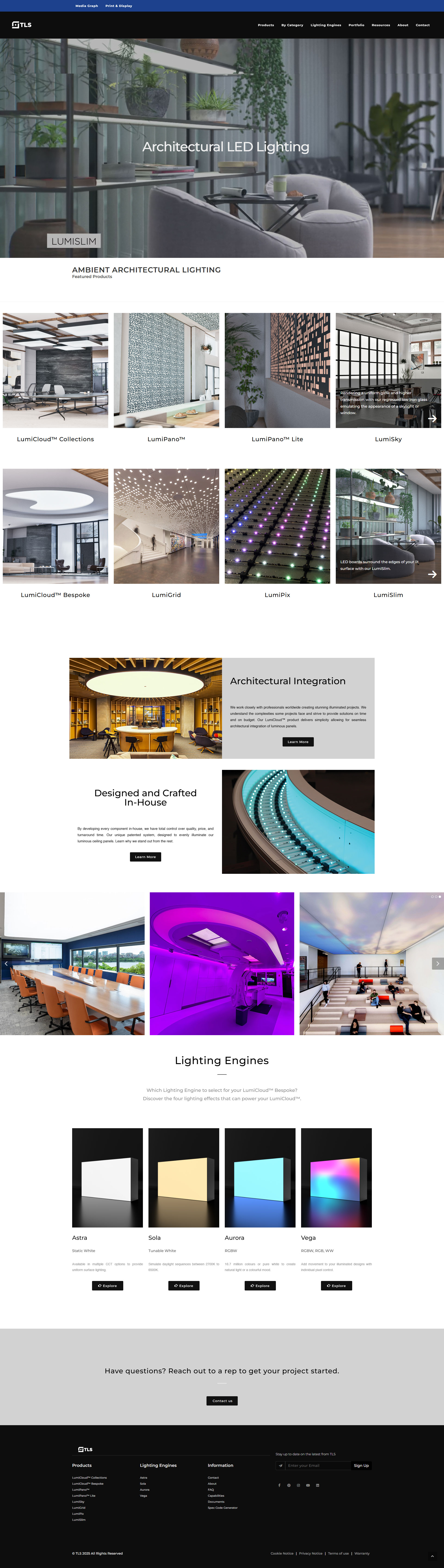
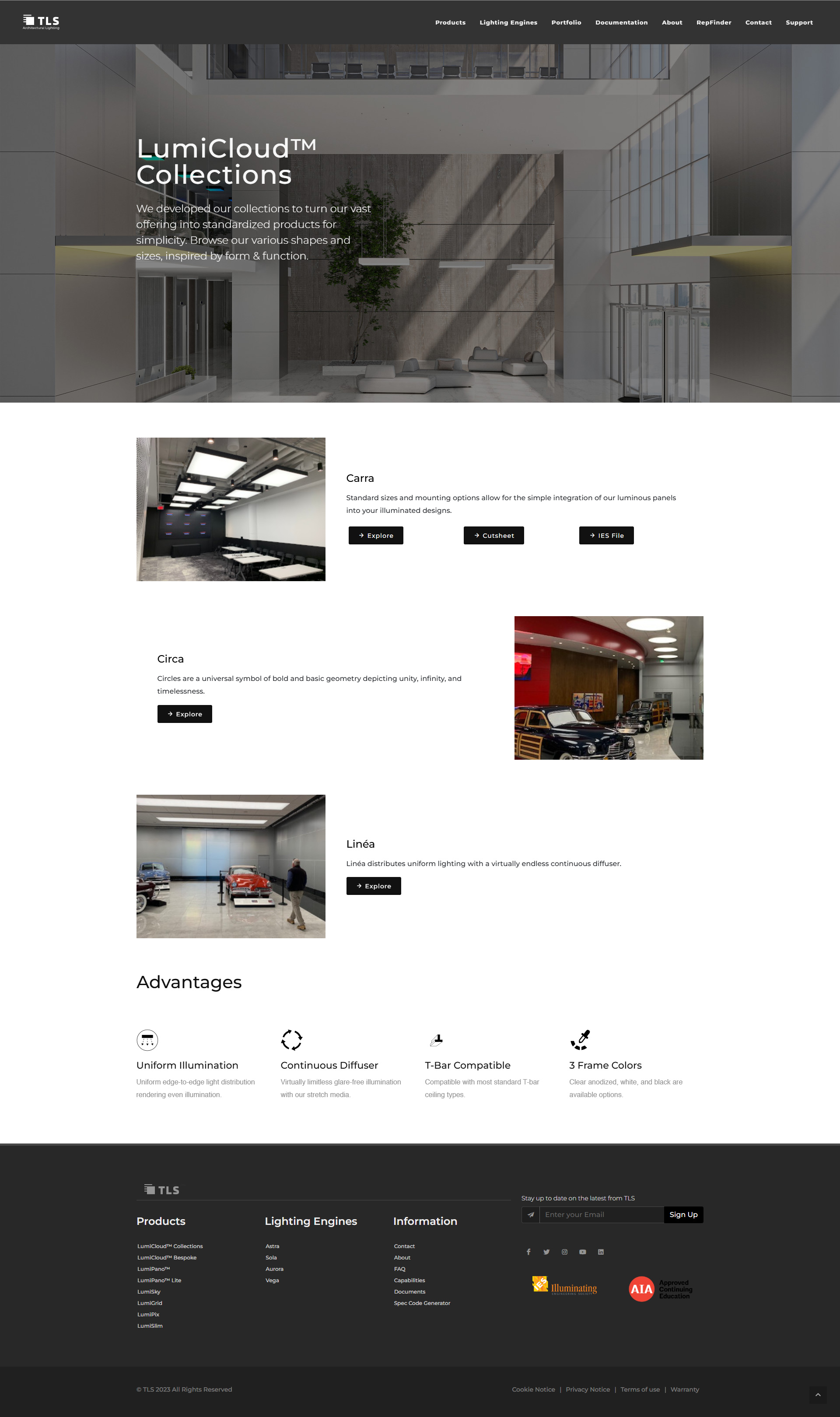
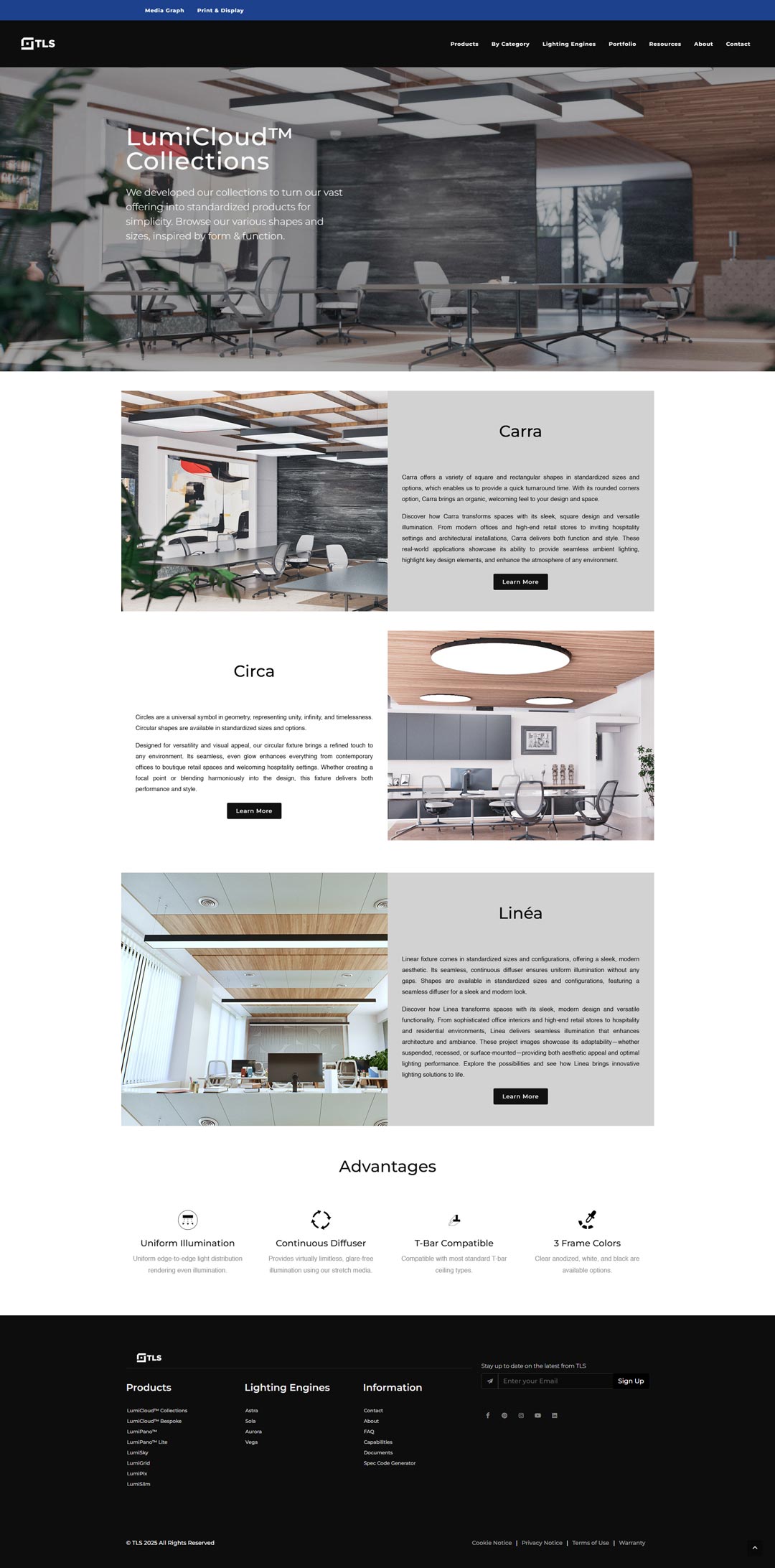
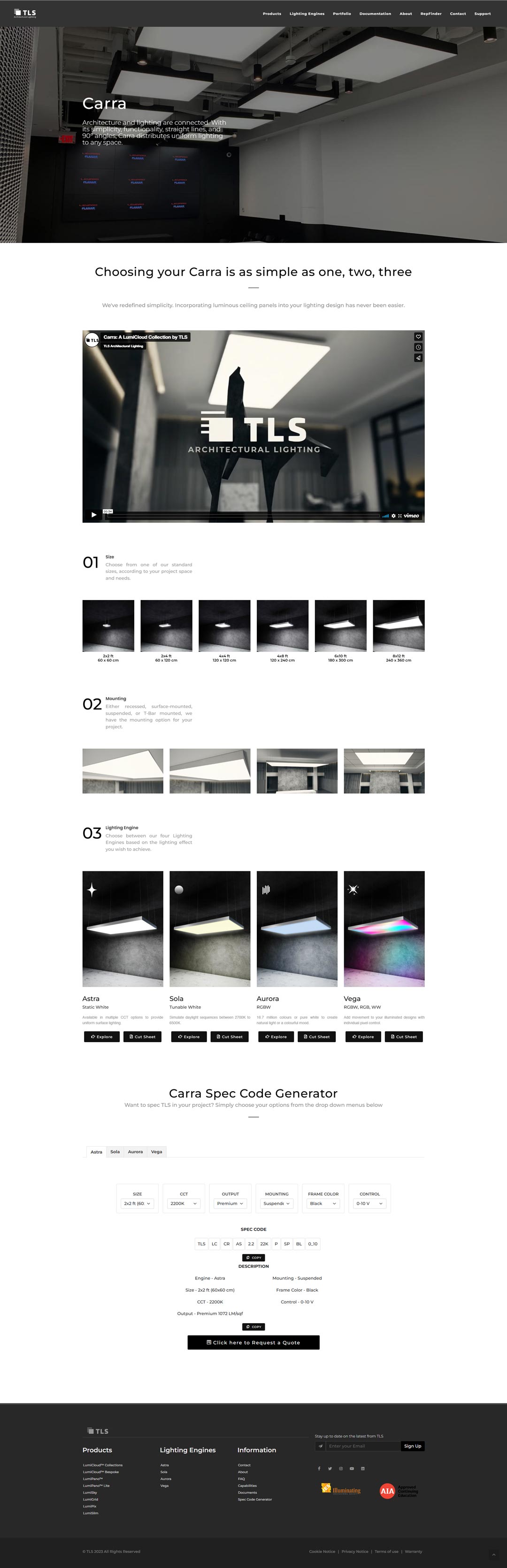
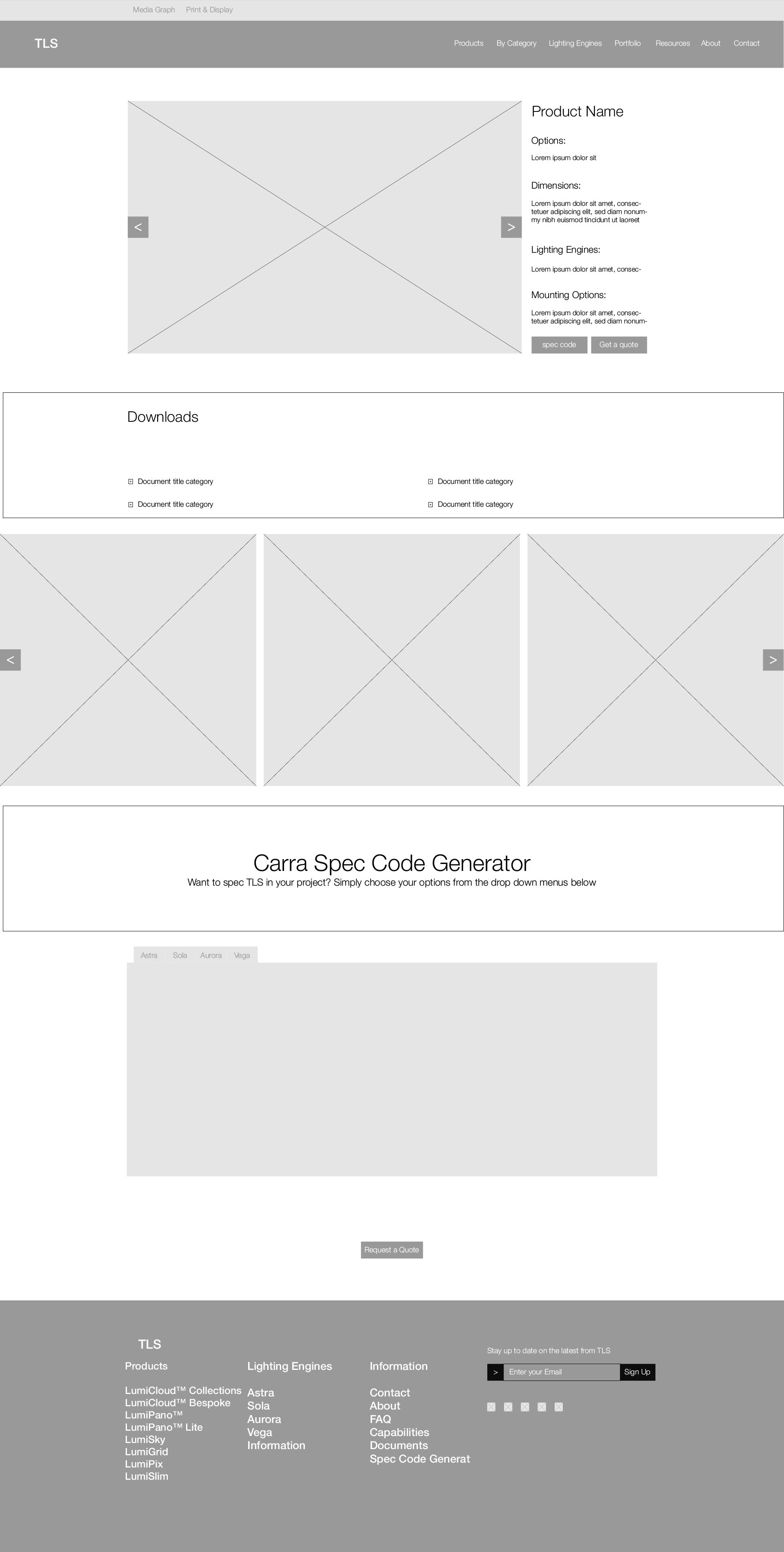
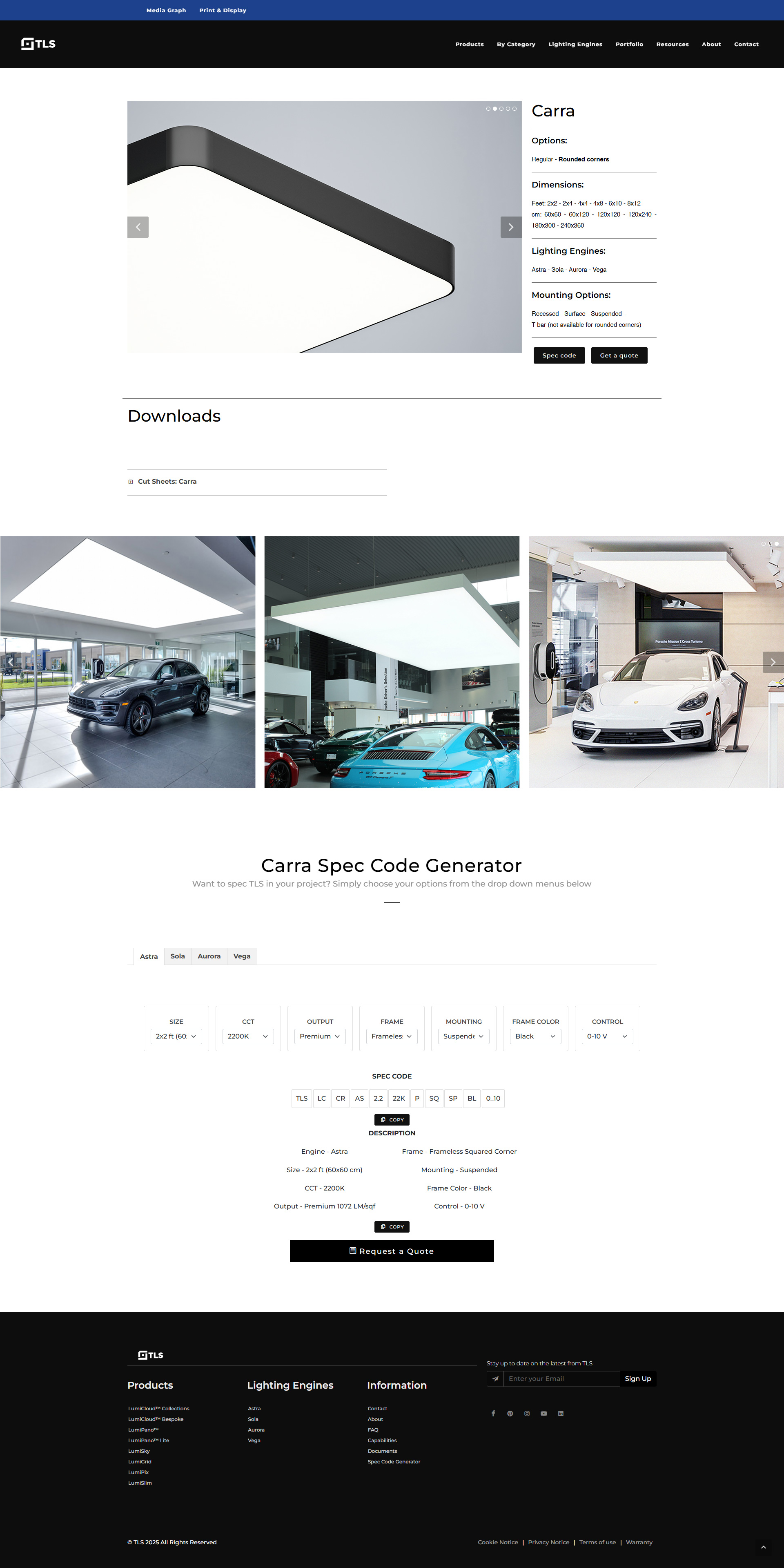
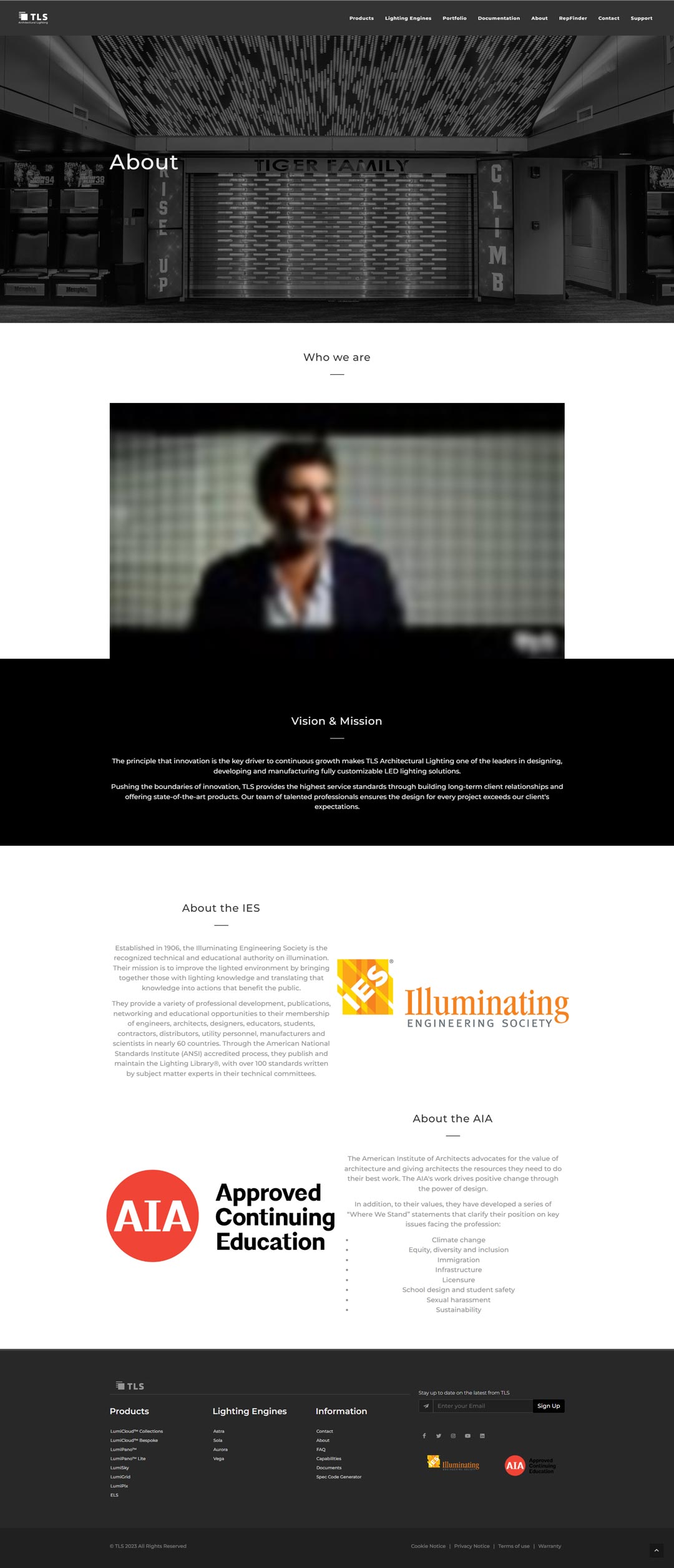
TLS
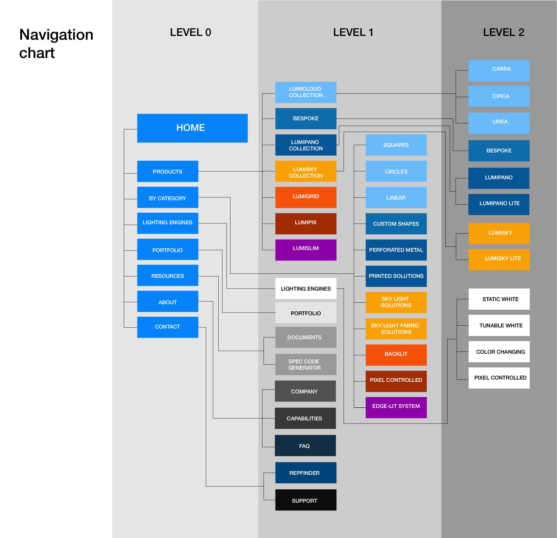
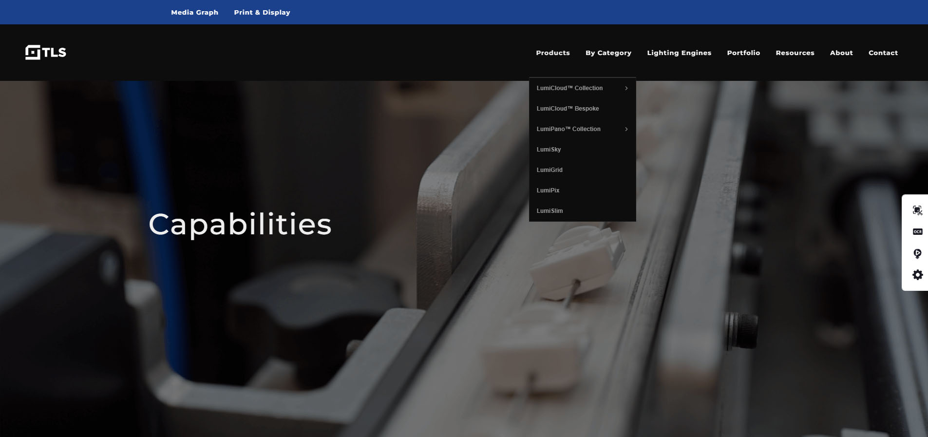
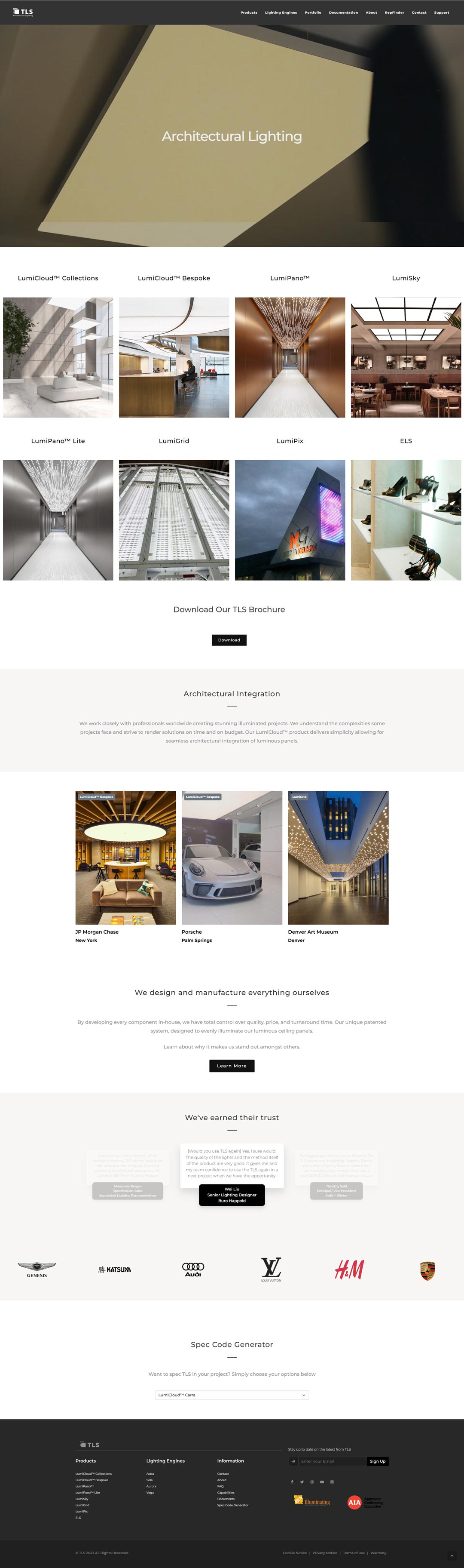
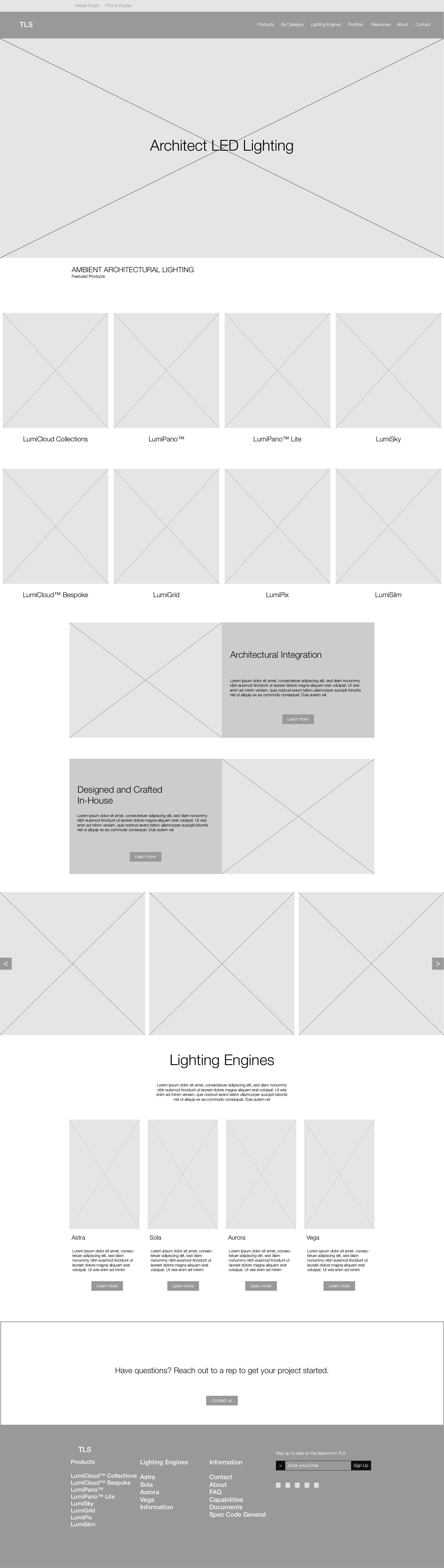
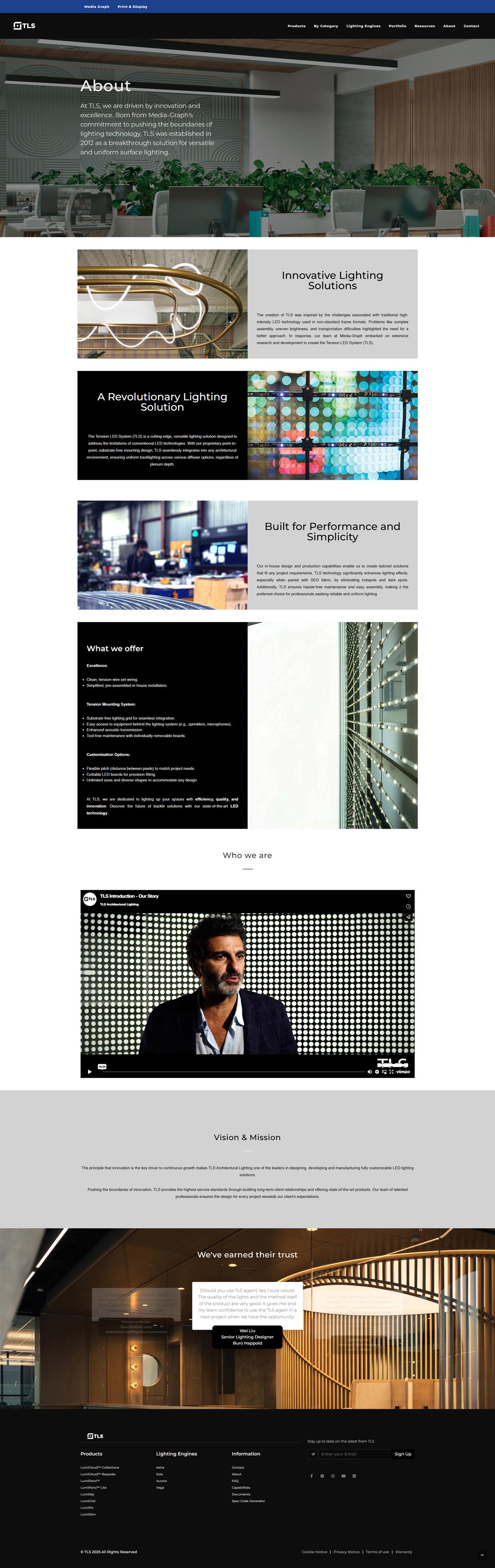
As part of a global rebranding of Media-Graph and its specialized brands, the TLS website required a significant user experience overhaul. The brand had evolved into a forward-thinking player in architectural LED lighting solutions, but its digital presence did not reflect this transformation.
- ClientTLS Architectural Lighting
- IndustryArchitectural Lighting
- ServicesUX/UI Design
- Websitetls-led.com